Test your voice agent
Voice Agent KPI Dashboard: What to Include
# Voice agent KPI dashboard: what to include
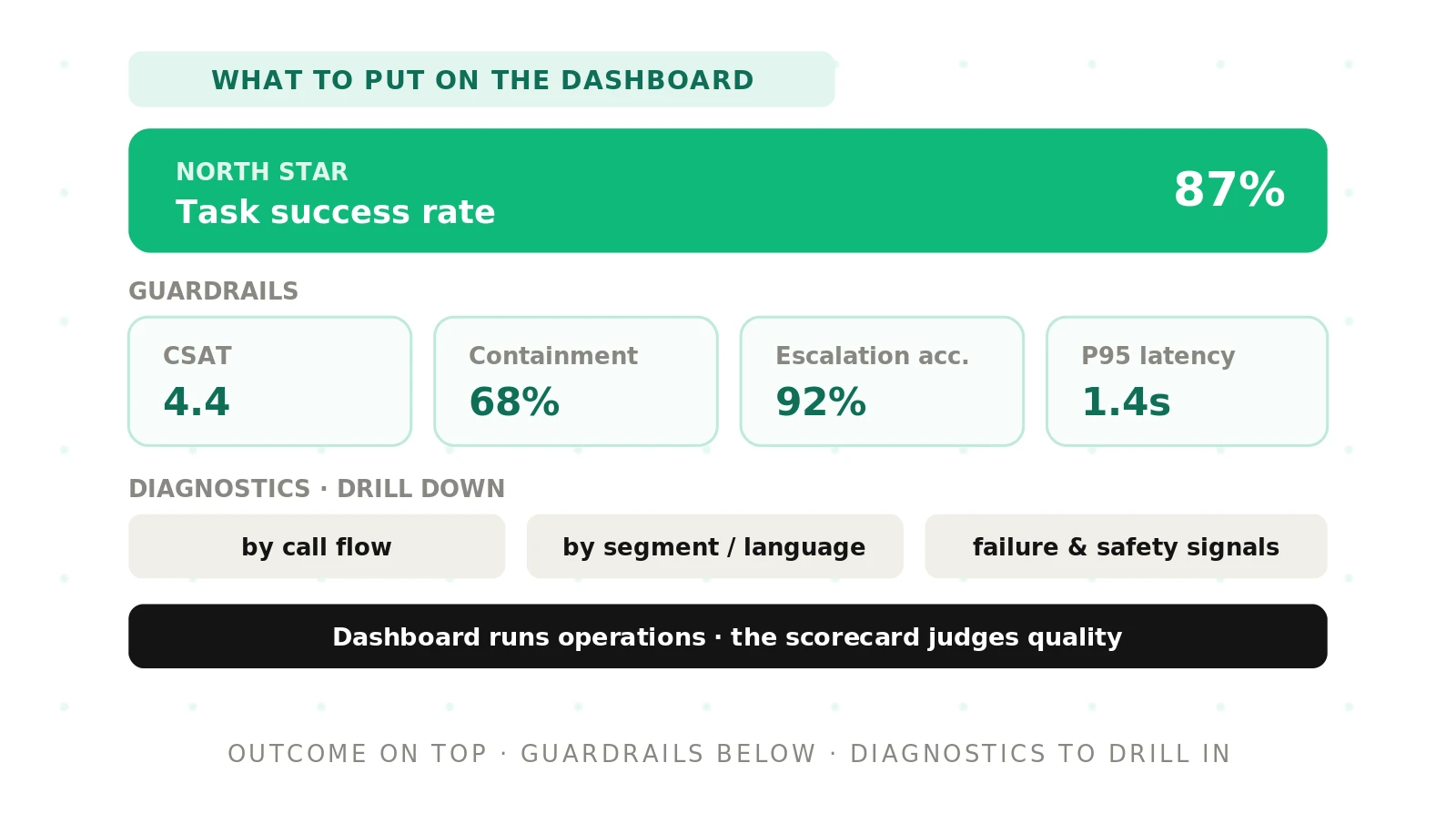
> Quick answer: A voice agent KPI dashboard shows one north-star outcome up top, a row of guardrail metrics under it, and diagnostic drill-downs below. It surfaces trends and thresholds, not just today's number, and links every tile to an action. The goal is running operations, not judging quality.
Most voice agent dashboards are a wall of numbers. They look busy and prove nothing. Someone glances at the screen, sees green, and moves on. Nothing on the screen tells them what to do next.
A good dashboard is different. It ranks metrics by importance. It shows whether each one is trending the right way. It flags the ones that crossed a line. This post covers what to include, how to arrange it, and what to leave off.
A dashboard runs operations; a scorecard judges quality
These two tools get confused, so start with the split. A dashboard) is an operational instrument. It is the thing you watch every day to keep the agent running well.
A scorecard is an evaluation rubric. It decides whether the agent is good enough, using defined tests and thresholds. You run it before a launch or during a formal review. Our voice agent metrics scorecard covers that job in full.
The difference matters for what you build. A scorecard can be slow, deep, and run monthly. A dashboard has to be fast, shallow, and readable in seconds. The same metric can live in both, but its job changes.
> KPI dashboard: a live display of the key performance indicators that show whether an operation is healthy right now. It is built for glancing, not for grading.
On a scorecard, task success is a verdict. On a dashboard, task success is a heartbeat. One asks "did it pass." The other asks "is it still fine." Keep that framing as you decide what goes on the screen. For the deeper split between the two disciplines, see our guide on testing versus evaluation.
The three tiers of a voice agent KPI dashboard
A working dashboard has three tiers, stacked by importance. The eye should travel from top to bottom and get less urgent as it goes.
Tier one: the north-star tile
The top of the dashboard holds a single outcome metric. This is the number the whole agent exists to move. For a support agent it is usually resolution rate. For a booking agent it is completed bookings. For collections it is promises kept.
Put it alone, large, at the top left. One north star, not three. If you cannot name a single metric that captures success, you do not yet know what the agent is for. That is a strategy problem, not a dashboard problem.
The north-star tile carries a trend line and a target. Today's value means little without both. A resolution rate of 68 percent is good or bad only against last week and against the line you drew.
Tier two: the guardrail tiles
Under the north star sits a row of guardrail metrics. These are the numbers that must not degrade while you chase the north star. They catch the trade-offs that a single outcome metric hides.
Four guardrails belong on almost every voice agent dashboard:
- CSAT or post-call sentiment. Did the caller leave satisfied. A rising north star with falling CSAT means you are winning on paper and losing the room.
- Escalation accuracy. When the agent hands off to a human, was that the right call. Both a missed escalation and a needless one are failures.
- Tail latency. Report the 95th and 99th percentile response time, never the mean. The slow tail is what makes callers talk over the agent.
- Containment. Track it only in its honest form, paired with satisfaction and callback rate. Raw containment rewards agents that trap people. We unpack this in our containment versus deflection guide.
Guardrails work as a set. Each one guards against a way the north star can be gamed. A high resolution rate that comes from refusing to escalate is not a win. The escalation-accuracy tile is what exposes it.
Tier three: the diagnostic tiles
The bottom tier answers the next question: when a guardrail turns red, why. These are the drill-down views that split a top-line number into its parts.
Diagnostics include word error rate on critical entities, tool-call accuracy, latency by pipeline stage, and quality or safety pass rates. They also include the same metrics split by flow and by segment. A drop in resolution rate means one thing across the board and another if it is confined to Spanish-language calls after 6pm.
Diagnostic tiles do not need to be visible at all times. They live one click down from the guardrail they explain. That keeps the top of the dashboard calm while the detail stays reachable.
Dashboard tiers, metrics, and who reads them
The table below maps the three tiers to the metrics they hold and the audience that lives in each. Illustrative examples, not benchmarks.
| Tier | What it shows | Example metrics | Primary audience |
|---|---|---|---|
| North star | The single outcome the agent exists to move | Resolution rate, completed bookings, promises kept | Executives and product |
| Guardrails | The trade-offs that must not degrade | CSAT, escalation accuracy, tail latency, honest containment | Operations and CX leads |
| Diagnostics | Why a guardrail moved, split by flow and segment | Critical-entity word error rate, tool-call accuracy, latency by stage, safety pass rate | Engineering and QA |
Read the table top to bottom and the dashboard designs itself. Each audience gets the tier that matches the decisions they make. Executives act on the north star. Operations act on guardrails. Engineers act on diagnostics.
Laying out the dashboard by audience
One dashboard rarely serves everyone. The fix is not more screens. It is filtered views over one shared set of metrics, so nobody argues about whose number is right.
The executive view
Executives need the north star, its trend, and a red or green flag on the guardrail set. Nothing else. Give them one screen they can read in ten seconds between meetings. Depth here is noise. The temptation to add "just one more chart" is how a leadership view becomes unreadable.
The operations view
Operations owns the guardrails. Their view leads with CSAT, escalation accuracy, latency, and containment, each with its threshold and trend. It adds the top diagnostic that explains any red guardrail today. This is the view that drives the daily stand-up. It should answer "what is wrong and where" without a click.
The engineering view
Engineers need diagnostics first. Their view leads with tail latency by pipeline stage, tool-call accuracy, and word error rate on critical entities. It links each spike to the transcripts behind it. This is where a metric stops being a number and becomes a bug to fix. For the wider picture of watching an agent in production, see our guide to monitoring AI voice agents in production.
The point of three views is not decoration. It is respecting attention. A person who sees only the metrics they can act on trusts the dashboard and uses it. A person buried in irrelevant tiles learns to ignore the whole thing.
Show trends and thresholds, not just today's number
A bare number is almost useless. Two additions make it decision-ready: a trend and a threshold.
The trend answers direction. A containment rate of 72 percent tells you nothing on its own. Next to a line showing it fell from 80 percent over two weeks, it tells you to investigate. Data visualization exists for exactly this. The shape of a line lands faster than a table of values.
The threshold answers acceptability. Every guardrail tile needs a line drawn on it: the point below which the metric is a problem. Colour the tile against that line, not against zero. A tile is green because it clears its threshold, not because the number is high.
Setting those lines is its own discipline. Pick them from real caller impact and your own baselines, not from a vendor's marketing. Our post on voice agent metric thresholds walks through how to choose defensible numbers.
Trends also expose slow drift that a snapshot hides. An agent can degrade half a percent a day for a month and never trip a single-day alarm. The trend line makes that slide visible while there is still time to act.
Vanity metrics and clutter to leave off
The fastest way to ruin a dashboard is to fill it. Every extra tile costs attention and hides the tiles that matter. Guard the screen as hard as you guard the guardrails.
Information overload is the real risk. Research on dashboard design finds that unfocused displays fail to drive decisions; the academic survey What Do We Talk About When We Talk About Dashboards? traces how purpose, not volume, makes a dashboard work. More tiles is the opposite of more insight.
Three families of number belong off the operational dashboard:
- Raw call volume. It rises with demand, marketing, and outages. It says nothing about whether the agent worked. A broken agent that loops callers can post a record volume.
- Blended averages. Average latency and average handle time hide the tail that actually hurts. If a percentile view exists, the average is clutter.
- Raw containment alone. Without satisfaction and callback beside it, containment rewards trapping people. It reads as success while callers give up.
A metric earns a tile only if a person would change a decision based on it. If no action follows from a number, it is a report line, not a dashboard tile. Move it to the weekly review and reclaim the space.
Link every tile to an action
The test of a dashboard tile is simple. When it turns red, does everyone know the next move. If the answer is a shrug, the tile is decoration.
Give each guardrail a written response. When escalation accuracy drops, the response is to pull the misrouted transcripts and check the handoff rules. When tail latency spikes, the response is to open the per-stage view and find the slow span. Write these next to the tile, not in a runbook nobody opens.
Actions are what separate a dashboard from a poster. A poster informs. A dashboard triggers work. The link from tile to action is the whole reason the screen exists.
How to build a voice agent KPI dashboard
Follow these steps in order. The sequence matters, because a north star chosen late forces a rebuild.
1. Name the one north-star outcome. Decide the single result the agent exists to produce, and how you will measure it. Put it at the top left with a trend and a target.
2. Choose four or five guardrails. Pick the metrics that must not degrade while the north star climbs: satisfaction, escalation accuracy, tail latency, and honest containment.
3. Set a threshold on every guardrail. Draw the line where each metric becomes a problem, based on caller impact and your baselines, not vendor claims.
4. Add trend lines everywhere. Give each tile a rolling window so direction and drift are visible, not just today's value.
5. Build the diagnostic drill-downs. Split each guardrail by flow and segment, and link the tiles to the transcripts behind them.
6. Create the three audience views. Filter the same metric set into executive, operations, and engineering layouts so each sees only what it can act on.
7. Attach an action to each tile. Write the response for every red state next to the tile, so nobody has to guess.
8. Prune on a schedule. Review the dashboard monthly and cut any tile that has never once changed a decision.
Build it in that order and the dashboard stays lean. Add tiles freely and it rots within a quarter.
Where independent evaluation fits
A dashboard shows your own numbers, measured your own way. That is exactly why it cannot be the last word on quality. The instrument and the thing it measures share an owner.
This is where an independent evaluator earns its place. Evalgent scores the same agent against held-out cases and consistent thresholds, so the dashboard's picture gets an outside check. When the dashboard says the agent is healthy, an independent audit confirms it is healthy for reasons that hold up. Our overview of independent voice AI evaluation explains why the split matters, and the broader discipline sits in our guide to voice agent evaluation.
The dashboard runs the day. The evaluation grades the work. You want both, and you want the grader to be someone other than the team it is grading.
Frequently asked questions
What should a voice agent KPI dashboard include?
A voice agent KPI dashboard should include one north-star outcome metric at the top, four or five guardrail metrics under it, and diagnostic drill-downs below. Each tile needs a trend line and a threshold. Include only metrics that change a decision, and attach a written action to every guardrail.
What is the difference between a dashboard and a scorecard?
A dashboard is an operational tool watched daily to keep an agent running. A scorecard is an evaluation rubric that judges whether the agent is good enough, using defined tests. The dashboard asks "is it still fine," while the scorecard asks "did it pass." The same metric plays a different role in each.
What is the north-star metric for a voice agent?
The north-star metric is the single outcome the agent exists to produce. For a support agent it is usually resolution rate. For a booking agent it is completed bookings. For collections it is promises kept. If you cannot name one, the agent's purpose is not yet clear enough to measure.
How many metrics should a voice agent dashboard show?
Show one north star, four or five guardrails, and a small set of diagnostics one click down. Beyond that, extra tiles cause information overload and hide the numbers that matter. A metric earns a tile only when a person would change a decision based on it; otherwise move it to a weekly report.
Which voice agent metrics are vanity metrics?
Raw call volume, blended averages like mean latency, and raw containment on its own are the common vanity metrics. They rise while the real experience gets worse. Volume tracks demand, not quality. Averages hide the painful tail. Raw containment rewards agents that make escalation hard for callers.
How do you lay out a dashboard for executives versus engineers?
Give executives the north star, its trend, and a red or green flag on the guardrail set, all on one glanceable screen. Give engineers the diagnostics: tail latency by stage, tool-call accuracy, critical-entity word error rate, and links to transcripts. Filter one shared metric set into role-specific views rather than building separate systems.
How do you set thresholds on a voice agent dashboard?
Set thresholds from real caller impact and your own historical baselines, not from vendor marketing numbers. Draw a line on each guardrail marking where the metric becomes a problem, and colour the tile against that line. Review the thresholds as the agent and its traffic change, since a stale line stops meaning anything.
Should each dashboard tile link to an action?
Yes. Every guardrail tile should have a written response for its red state, placed next to the tile rather than buried in a runbook. If nobody knows the next move when a tile turns red, it is decoration, not instrumentation. The link from a metric to an action is the reason the dashboard exists.
The bottom line
A voice agent KPI dashboard exists to drive daily action, not to display numbers. Rank one north star above a few guardrails and their drill-downs, give every tile a trend, a threshold, and an action, and cut everything else.
Ready to check your dashboard's numbers against an independent standard? Book a demo and see how Evalgent audits the same agent your dashboard watches.
Related Articles
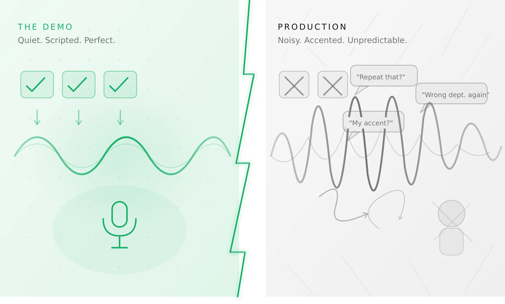
Why AI voice agents fail in production (and how to prevent it)
AI voice agents that ace demos still break in production. Learn the 5 root causes, how to test for each, and what production readiness actually means.
Read more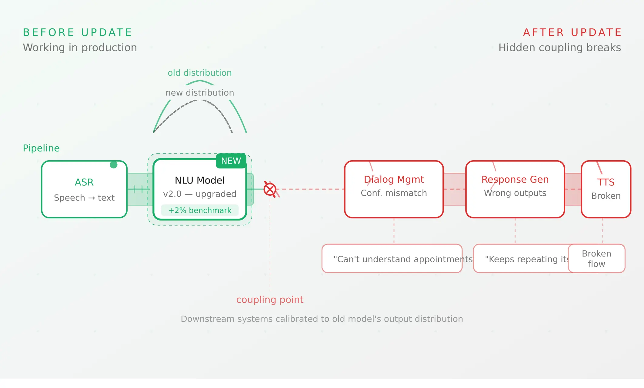
Voice agent regression testing: why LLM updates break production
LLM updates improve benchmarks but break voice agents in 5 predictable ways. How to detect and prevent regressions after every model or prompt change.
Read more